

Why Isn’t My Website Generating Enquiries?

If your website looks professional but still brings in few enquiries, the problem is usually not traffic alone. This guide explains the most common conversion blockers and what small businesses can improve first.
Olymaris Team
Published on July 7, 2026
Why isn’t my website generating enquiries?
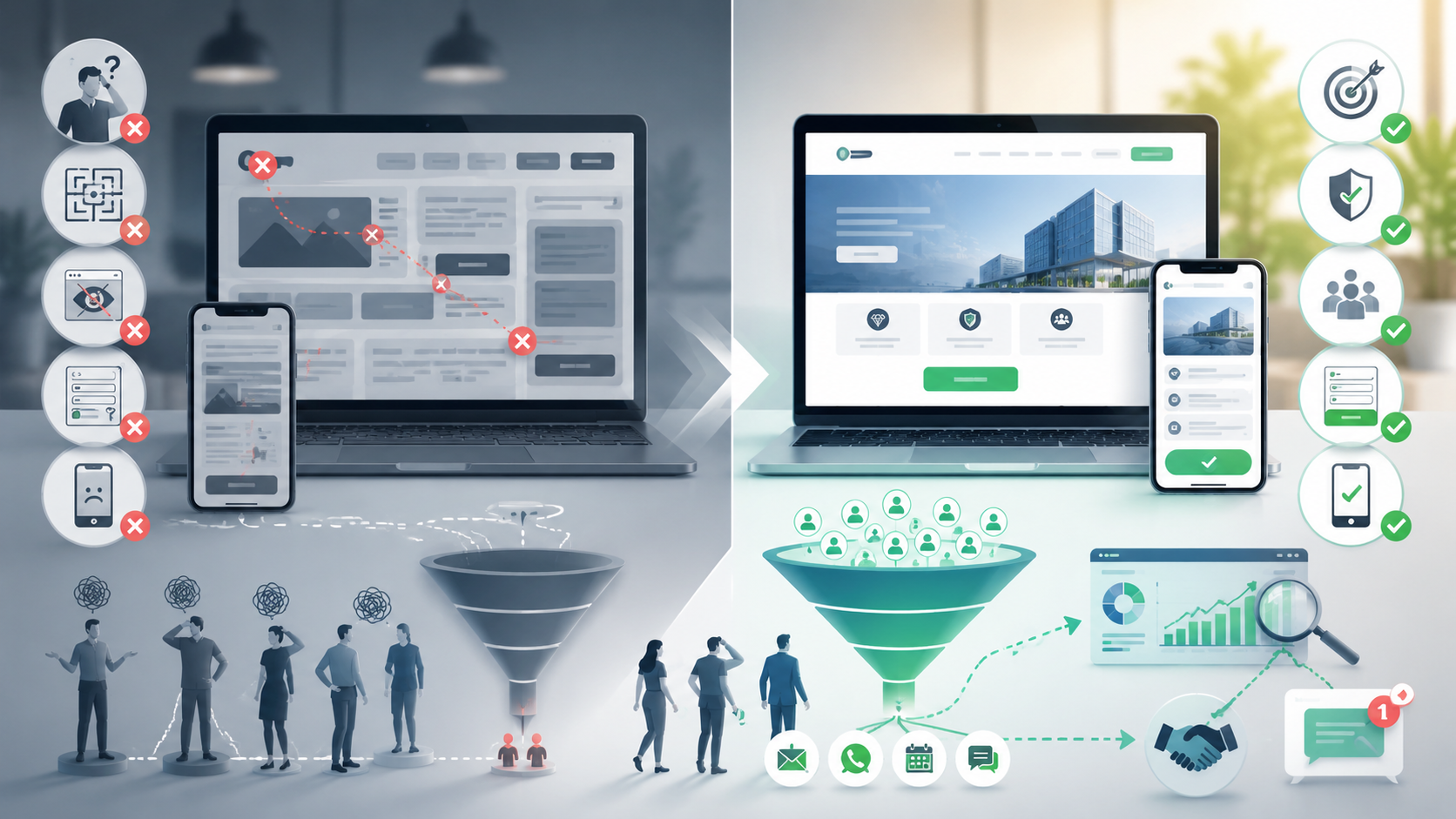
Many small businesses assume the problem is traffic. In reality, a website can attract visitors and still fail to create enquiries because the message is unclear, the offer feels vague, trust is too weak, or the next step asks too much too soon.
If your site feels more like a brochure than a sales tool, the issue is usually not one dramatic mistake. It is a chain of small conversion blockers. That is exactly where a Website Sales Machine approach becomes useful: it treats your website as a business system that should guide the right visitor toward contact.
Short answer
Most websites do not generate enquiries because visitors cannot quickly understand what you offer, why they should trust you, and what they should do next. Better positioning, clearer CTAs, stronger trust signals, simpler contact paths, and cleaner mobile experience usually matter more than adding more pages.
1. Your offer is not clear enough
Visitors make a fast decision: is this relevant to me or not? If your homepage talks in broad claims, generic quality statements, or internal company language, people may leave before they understand the value.
For managers and founders, this often shows up as a frustrating pattern: the website looks polished, but the sales team still has to explain the basics in every first call. That is a sign the website is not doing enough pre-selling.
- State who you help.
- Explain the problem you solve.
- Show the business outcome, not just the service label.
2. Your calls to action are too weak or too early
A button alone does not create demand. If the page asks visitors to contact you before they understand the offer, many will delay the decision. On the other hand, if the CTA is buried, vague, or repeated without context, people may not know how to move forward.
Good CTAs reduce decision friction. They match the visitor’s stage, explain the next step clearly, and appear after enough trust and context have been built.
Weak pattern
Generic buttons with little explanation and no reason to act now.
Stronger pattern
A clear next step supported by proof, relevance, and a simple contact path.
3. Your website does not build enough trust
Even interested visitors hesitate when the site gives them too little confidence. This is common in service businesses, B2B offers, consulting, and higher-value projects where buyers want reassurance before they enquire.
Trust is built through clarity and evidence. Visitors want to see that you understand their situation, that your process is credible, and that contacting you will not waste their time.
- Clear explanation of your offer and process
- Relevant references or proof elements
- Visible contact options and realistic next steps
- Consistent messaging across key pages
4. The contact path has too much friction
Sometimes the website does its job until the final step. Then the form is too long, the contact page feels cold, or the user has to search for basic details. Every extra obstacle reduces response rate.
For small companies, this matters because lost enquiries are not abstract metrics. They are missed sales conversations. Improving forms, contact paths, and landing page structure can have a direct business effect without needing a full rebrand.
5. Mobile experience and speed are hurting conversion
A site can feel acceptable on desktop and still lose serious opportunities on mobile. If text blocks are hard to scan, buttons are awkward, pages feel slow, or forms are frustrating on a phone, visitors often leave before contacting you.
This is not just a technical issue. It affects lead quality, campaign efficiency, and how professional your business feels in the first minute.
6. You are measuring traffic, not enquiry behaviour
Many businesses know how many visitors they get, but not where interest drops. Without basic analytics and conversion tracking, it is hard to tell whether the problem is the message, the CTA, the form, or the page structure.
That is why the broader guide Turn Your Website Into a Sales Machine: More Leads and Revenue is useful as a next read. It explains the bigger system behind messaging, trust, SEO, and lead flow, while this article helps you diagnose why enquiries are missing right now.
What to improve first
Message
Make the offer easier to understand in the first few seconds.
Trust
Add proof, process clarity, and reassurance before the CTA.
Contact path
Reduce friction in forms, buttons, and next-step explanations.
Ready to turn your website into a stronger lead source?
If your website looks fine but still does not create enough enquiries, the next step is to review the sales path, not just the design. Explore the service or get in touch to discuss your current website.
Comments
0 published comments
No approved comments have been published yet.
Recommended Articles
Fresh insights from our blog

AI Automation for Small Businesses: What Is Actually Worth It?
Not every AI idea is worth the effort. This guide shows small businesses which workflows are worth automating first, how to judge readiness,...

CRM for Small Businesses: A Practical Guide to Starting Simple
A practical guide for owners and managers who want a simple CRM without turning sales into a software project. Learn when a CRM is worth it,...

Turn Your Website Into a Sales Machine: More Leads and Revenue
A practical guide for small businesses that want their website to do more than look good. Learn how clearer messaging, stronger trust, bette...

Medical Practice Website: Booking, Forms, Costs
A practical guide to building a medical practice website that helps patients book online, submit forms, and understand what affects cost.

Driver Tracking for Small Transport Companies: Features and Costs
A practical guide to driver tracking for small transport companies: what it does, what to look for, and how to think about cost and rollout.

Holiday Apartment Website with Booking System: What Owners Really Need
A practical guide for holiday apartment and serviced apartment owners who want a booking website that shows availability, builds trust and t...